Web • Mobile • News • Multimedia
Mobile Subscription Initiative

INTRODUCTION
Subscription buttons are incredibly important to any website with a subscription service. These buttons serve as a gateway for users to opt into ongoing services or content. They streamline the subscription process, making it effortless for users to sign up for unlimited content. It's a key tool for driving ongoing engagement, building relationships, and sustaining revenue streams.
MY ROLE
I contributed to the overall design process and oversaw aspects related to product scoping, user flows, wireframes, prototyping, and usability testing.
TEAM
UX Designers (UX Team Lead & Myself), UX Researcher, 2 Developers, QAs, and Product Managers.
PROJECT SCOPE
4-5 weeks
TOOLS
Figma, Confluence, JIRA, Microsoft Teams, Wordpress
The Context
ℹ️ The Company — Who is Postmedia Network?
Postmedia Network is a big name in Canadian media, known for major papers like The National Post, The Vancouver Sun, The Calgary Herald, and The Ottawa Citizen. These publications are viewed by millions of Canadians daily, keeping them in the loop about everything from local news to worldwide events. With over 120 brands, Postmedia covers communities from the smallest towns to the country's largest cities, making sure everyone has access to news that is important to them.
If you want to learn more visit Postmedia.com
👥 Users Persona’s — Our Audience
As a company, we already know who our users are and who we are designing for. This takes a small step in the discovery process, for all of us at the company, but I will share our users with you so you can see who we designed this for!
Postmedia Network has a broad spectrum of users, ranging from avid news consumers to casual readers seeking reliable, up-to-date information. The user base includes:
The News Enthusiast: Craves in-depth news coverage and analysis, relying on Postmedia for comprehensive updates on current affairs.
The Local Commuter: Seeks quick, relevant news, especially local updates and traffic information, accessed conveniently during commutes.
The Business Professional: Looks for market insights, economic trends, and business news, relying on Postmedia for valuable financial information.
The Tech-Savvy Consumer: Prefers digital platforms and short, engaging news pieces, accessing news on the go via apps or social media integrations.
These four user types represent distinct preferences and behaviours, illustrating the diverse audience that we design for.
👥 The Users — Types of users we design for
Above is the personality of our users. On top of the personality, we have 3 main user types that we design for.


Project Overview

Overview
This project aimed to enhance the subscription experience for major newspaper websites, including the National Post, Financial Post, Calgary Herald, and the Toronto Sun. The existing subscription process was complex and unintuitive, leading to low conversion rates on mobile devices.
By the end of this project, we had a massive increase in conversion rates on mobile devices. Averaging a 900% increase in click rates — I KNOW WILD right!? But the data speaks for itself! Check it out in the results
The Goal
The primary goal of this subscription button is to allow users to easily subscribe from mobile devices, while ensuring it doesn't disrupt the user's reading experience.
The Problem
Problem Discovery
The subscription experience on mobile devices for Postmedia’s major markets is complicated and unintuitive.
Currently, users have to navigate through a series of steps by clicking on the hamburger menu and scrolling all the way to the bottom of the list to find the subscribe button. This method is cumbersome and inconvenient for users, leading to a poor user experience.
Given that 96% of visitors access the newspaper sites from their mobile devices, this issue represents a significant missed opportunity for increasing subscriptions. Therefore, finding a fast and effective solution to improve the mobile subscription experience becomes a top priority.
PROBLEM STATEMENT
“How might we simplify and improve the mobile subscription experience for our major markets to increase subscription rates from mobile devices? “
Research & Discovery
Analyzing Market & Competitors
By analyzing successful subscription experiences implemented by industry leaders, we sought to implement a user-centric design that resonated with our target audience.
The primary objective of this case study was to introduce a subscription button prominently on the homepage of each major newspaper to increase user engagement and drive conversions.
Reviewed subscription experiences of leading news and media companies, including the Washington Post, New York Times, Medium, USA Today, Global News, and the Toronto Star.
Explored their subscription models, pricing strategies, and user onboarding processes to gain insights into best practices.

🎯 How We Will Measure Success
An increase in the number of visits to the subscription offer page.
Increase in the number of subscribers.
Iterations & Brainstorming
✋ Development Constraints
Before getting into the designs the product and development team brought some constraints to our attention.
Projects occasionally face initial roadblocks. We encountered development constraints that limited our ability to explore particular design options as the development team informed us they couldn't modify the existing code or implement changes within our sprint timeframe.
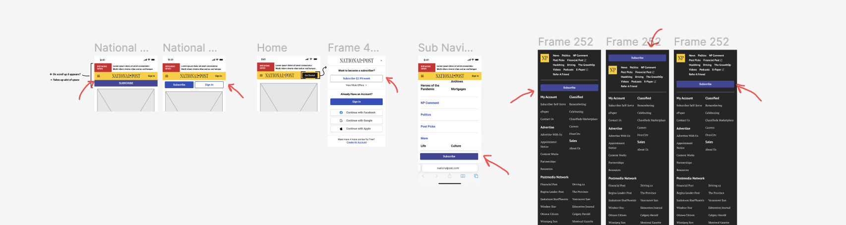
Specifically, we couldn't tweak the "breaking news bar" (which since has been updated in this project) or adjust the main navigation. These constraints posed challenges to our design process, narrowing down our options and restricting the scope of our explorations.
That’s okay though! We simply had to brainstorm doable ideas that fit into our sprint's timeline.
🔄 Iterations
Now the fun part! We get to come up with ideas that will eventually become the final product!
Given the development constraints and insights from our competitors' strategies, we had a clear project vision, minimizing the need for a lot of iterations. Our focus was on ensuring the visibility of the subscribe button on the homepage. Additionally, we aimed to introduce a new subscribe button in the footer for added visibility and ease of use. Additionally, we wanted to add a subscribe button in the footer to make it more visible and user-friendly, as this was part of our project goal to make it easy to subscribe while ensuring it doesn't disrupt the user's reading experience.
The Solution & Results
🎉 Solution

Our solution to enhance the subscription experience was to create an interactive subscribe button. By strategically placing the button below the navigation bar and incorporating hiding and reappearing behaviour based on user scrolling, we significantly improved user engagement.
Within the first month, conversion rates to the subscription page increased by over 1500%, resulting in 10,000 new subscribers. This success highlights the importance of user-centric design and optimizing the subscription experience for sustainable growth.
view the solution on your phone! Just visit the National Post
🏆 Results
The graphs illustrate the comparison before and after our solution implementation, displaying the subscription button clicks categorized by page and device.
In the initial graph, depicting the "before solution," user clicks on the subscribe button solely originate from desktop and tablet devices, averaging approximately 4.5k clicks per month. The absence of mobile clicks comes from the lack of a subscription button on mobile devices.
Following our implementation, a remarkable surge in mobile device clicks to the subscribe button is evident, now averaging around 45k clicks per month. That’s a 900% increase in clicks on the subscription button!!!
BEFORE SOLUTION

AFTER SOLUTION

Gallery


