Web • Mobile • News • Multimedia
Breaking News
INTRODUCTION
The breaking news bar is an important feature in the news industry. It provides key details on breaking events. It conveniently links our users to the top story on the topic. Its main purpose is to update users on significant developments, inviting them to explore the story in depth by clicking the provided link or heading to the news section of the website.
MY ROLE
I contributed to the overall design process and oversaw aspects related to product scoping, user flows, wireframes, prototyping, and usability testing.
TEAM
UX Designers (UX Team Lead & Myself), UX Researcher, 2 Developers, QAs, and Product Managers.
PROJECT SCOPE
3 weeks
TOOLS
Figma, Confluence, JIRA, Microsoft Teams, Wordpress
The Context
ℹ️ The Company — Who is Postmedia Network?
Postmedia Network is a big name in Canadian media, known for major papers like The National Post, The Vancouver Sun, The Calgary Herald, and The Ottawa Citizen. These publications are viewed by millions of Canadians daily, keeping them in the loop about everything from local news to worldwide events. With over 120 brands, Postmedia covers communities from the smallest towns to the country's largest cities, making sure everyone has access to news that is important to them.
If you want to learn more visit Postmedia.com
👥 Users Persona’s — Our Audience
As a company, we already know who our users are and who we are designing for. This takes a small step in the discovery process, for all of us at the company, but I will share our users with you so you can see who we designed this for!
Postmedia Network has a broad spectrum of users, ranging from avid news consumers to casual readers seeking reliable, up-to-date information. The user base includes:
The News Enthusiast: Craves in-depth news coverage and analysis, relying on Postmedia for comprehensive updates on current affairs.
The Local Commuter: Seeks quick, relevant news, especially local updates and traffic information, accessed conveniently during commutes.
The Business Professional: Looks for market insights, economic trends, and business news, relying on Postmedia for valuable financial information.
The Tech-Savvy Consumer: Prefers digital platforms and short, engaging news pieces, accessing news on the go via apps or social media integrations.
These four user types represent distinct preferences and behaviours, illustrating the diverse audience that we design for.
👥 The Users — Types of users we design for
Above is the personality of our users. On top of the personality, we have 3 main user types that we design for.


Project Overview

Overview
In a world of misinformation, staying up to date with breaking news from a trusted news source is crucial to retaining audience engagement and staying relevant. To address this need, Postmedia wanted to enhance its online presence by implementing a breaking news bar on its websites.
The Goal
The primary goal is to provide users with real-time updates on breaking news stories without disrupting their browsing experience. The breaking news bar is aimed to grab attention, convey urgency, and encourage users to dive deeper into developing stories.
We also want to
Segregate breaking news from marketing and account-related content within the bar.
Provide users with the option to scroll past the bar on both desktop and mobile interfaces.
🕰️ The history of the breaking news bar
The Breaking News bar was originally introduced at the beginning of the COVID-19 Pandemic to provide users with crucial updates and information during the lockdowns.
It played a pivotal role in delivering real-time news updates, health guidelines, and safety measures becoming a trusted source of information when our users need it most.

However……. as the pandemic slowed down and we posted less news on it, it started to drift away from its intended purpose …. Which leads us into the problem.
The Problem
Problem Discovery
Problem #1 — The Breaking News Bar DOES NOT Show Breaking News
As the pandemic news cycle slowed, the breaking news bar lost its original focus and turned into a hub for various initiatives.
1. Subscription drives
2. Newsletter promotions
3. Manage your print subscription
This poses a significant challenge as it could potentially cause confusion among readers regarding the bar's intended purpose. Consequently, users might ignore important breaking news alerts because they assume it is just another advertisement or promotion, making the breaking news bar less effective for crucial alerts.

Problem #2 — The Breaking News Bar has too many call outs and is confusing our users

On top of the breaking news bar showing different initiatives that are not breaking news, the current breaking news bar appears to have multiple calls to action (CTAs), and it is unclear to the user where they should click. On top of the breaking news bar showcasing various initiatives that aren't actually breaking news, the bar has multiple calls to action (CTA’s) and it’s creating some click confusion.
For instance, the prominent red box that reads “Subscribe“ during a subscription initiative appears clickable (it's not). The white section housing the initiative copy for "Subscribe" or "Newsletters" isn't clickable, and we need to hyperlink the words "Subscribe Now" to direct users to the intended location, making the main CTA of this bar tiny and unclear.
Additionally, the 'Manage Print' feature's placement raises hierarchy concerns, showing prominently above the subscription option. Moreover, the bar is universally visible among all users (Anonymous, Registered, Subscribed), creating a general upset among subscribed users who are seeing lower offers than their current subscription plan.
These issues collectively contribute to user frustration. To help focus and define these problems we came up with a problem statement.
PROBLEM STATEMENT
“How might we refocus the breaking news bar to prioritize timely and critical news updates, restoring its original purpose as a primary source for urgent information while maintaining space for promotional initiatives without overshadowing the news content? “
Discovery
Initial Ideas — Hypothesis
If we separate the breaking news notifications from marketing campaigns and other alerts by giving them less space, we can reduce the clutter and "casino effect," especially on small screens. By improving the reading experience for users, we can increase the number of page views and attract more active users over time. This approach will still allow us to deliver important alerts to users in a way that is clear and accessible.
What is the Casino Effect? It is a larger bet that we are tackling to reduce all of the noise on our homepages
Potential Risks and Rabbit Holes
If we separate the breaking news bar from marketing promotions, it solves the problem of breaking news, however, it creates a new problem.
While we need to improve the experience for our readers, we also need to consider the needs of our marketing and editorial teams.
We would be removing a primary target method that our marketing team uses to push subscription initiatives and the primary target method that the editorial team promotes their newsletters, which helps increase engagement.
We need to align with the different stakeholders to come up with a new solution for their marketing needs. After many discussions, we came up with an effective solution which can be found in the
Promotional Bar Case Study ↗ (Currently in Progress — Case Study coming soon)
The Users Needs
Our users need the following, to make this project successful
Having clearer communication, by separating the breaking news bar from other types of messages/alerts, this can help ensure that readers are aware of critical news updates that may impact them.
Reduced annoyance, by avoiding overuse of the breaking news bar for marketing campaigns or account-related options, readers are less likely to become annoyed or overwhelmed by alerts that are not relevant to them. This can help improve the overall user experience.
Readers are more likely to trust our sites as reliable sources of information.
🎯 How We Will Measure Success
An increase in the number of page views resulted from the clicks on the banner.
Increase in the number of active users over time
Research
Analyzing Market & Competitors
Competitive analysis and red routing revealed that 80% of our competitors had some type of breaking news bar or label during breaking events.
To get a good understanding of breaking news trends we looked into our competitor’s breaking news experiences.
Some of these competitors include major news media companies, such as CBC, the Global and Mail, CNN, the Washington Post, the New York Times, Medium, and the Toronto Star.
We conducted the competitive analysis using the "Red Routing" research method, which involved evaluating many of our competitors. We compared specific features, such as the presence of a "live" feature, and breaking news bar across these competitors. For each identified feature, we noted how many competitors incorporated it, providing insights into industry trends and common practices.


Iterations & Designs
🔄 Iterations — Breaking News
Now to the fun part! We get to start designs! I got to explore different styles and features to see what could work best.
We explored adding labels to the article cards

We explored a “Highlights section“ to include all the different initiatives that need to be included in this space


And finally we explored a bar that could be used as the main notification element

We presented our iterations to the key stakeholders in the project and selected the bar design. As this was in our opinion the best solution to the problem.
As we started to finalize the designs we had to go over specifics such as the development constraints and the business constraints .
✋ Development Constraints
As is common in design projects, the perfect solution is not always possible due to code restrictions. In this case, development was not able to make the bar closeable — so we had to make some minor adjustments to our designs.

The Solution & Results
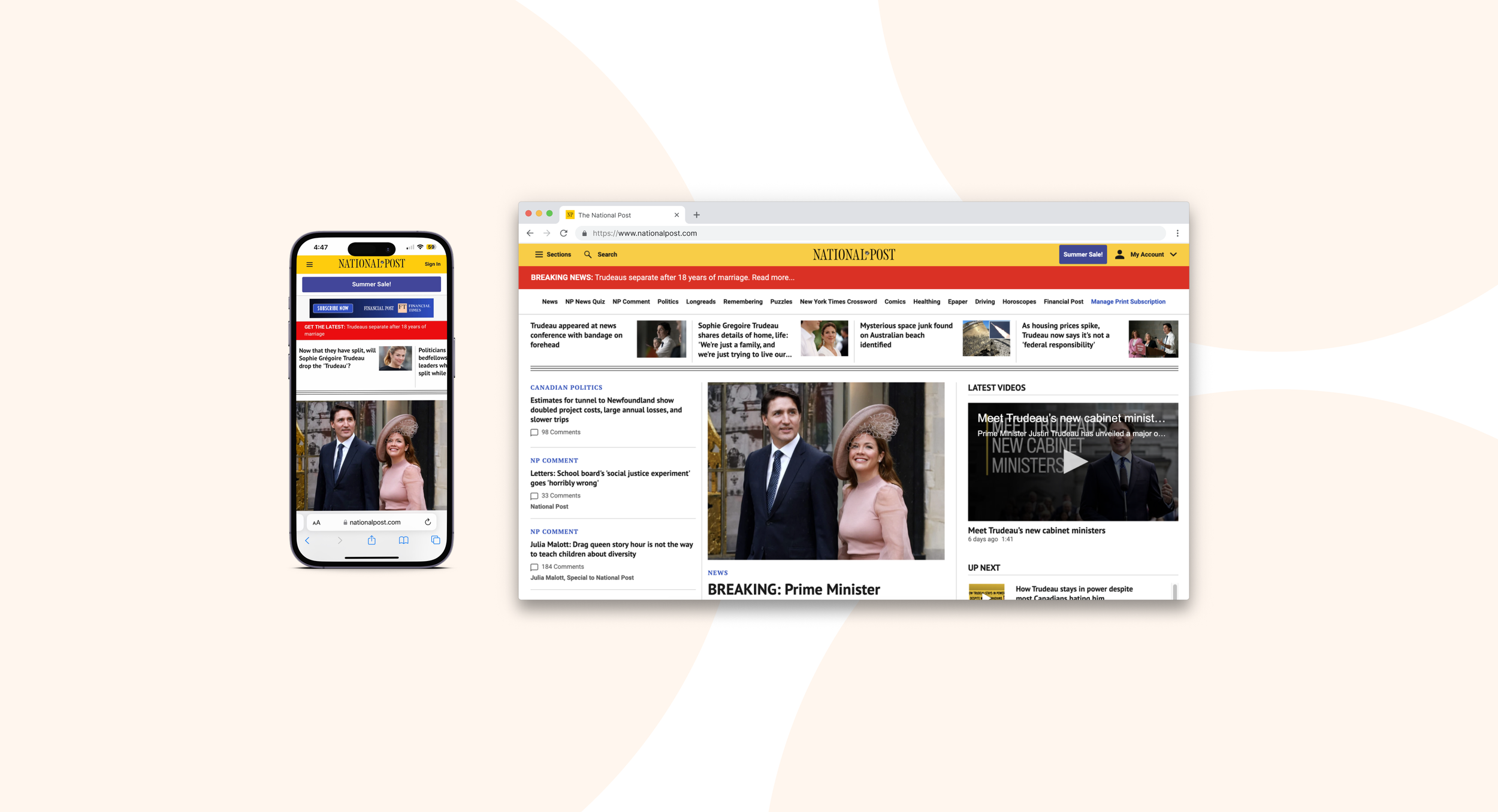
🎉 Solution
Live results displaying real-life breaking news
The breaking news banner is now live across all of Postmedia’s markets.
The breaking news banner displays a red bar, which is clickable and directs the user to the top story that the editorial wants to push during the breaking event.
As you may remember one of the problems was that marketing and editorial relied on the old breaking news bar to push their separate initiatives, we came up with a separate solution in another project for them called the Promotional Banner ↗


The Rules
Breaking News will only be displayed when there is Breaking News.
Breaking News will take over the Promotional Bar, when breaking news occurs. Promotional Banner↗
The whole bar would be clickable and the URL needed to be included within the configuration.
The users would see the banner at the top when they land on any page and when they scroll down, it would be hidden. When they scroll back all the way to the top, it would show up.
The access to the breaking news content should be granted to a group of selected editors, (we could probably look at the breaking news from WP, if that’s possible to use).
We need to add click-tracking events for the different types of clickable banners.
🏆 Results
As the breaking news only shows during breaking news events, we have limited data. Within the first month of launching we had 1 breaking news event. The banner displayed for 24 hours on our flagship market The National Post. Here is the result

Final Thoughts
💭 takeaways
In each project, I gather insights, explore new research methods, competitor strategies, and industry trends. While this project faced challenges, they were all within manageable bounds.
The new and improved breaking news bar seamlessly delivers breaking news, with designs that captivate attention without interfering with their primary goal—accessing our content. Maintaining an unobtrusive yet compelling approach aligns with our users' preference for uninterrupted content consumption.
The number of discussions from our design iterations generated some ideas for additional projects. It's a testament to the continuous evolution in our field, always presenting new opportunities. There's an excitement in the perpetual cycle of innovation and improvement—it's a field where there's never a shortage of things to explore and develop!